
TL;DR
- A listicle landing page is a numbered article between your ad and your PDP. It makes five short arguments instead of one long one.
- Five items is the default. Keep items 1 and 2 product-neutral, bring the product in at item 2 or 3, and put proof inside the item it supports.
- Sources disagree on CTA count, so test it. Skip the format for retargeting, branded search and impulse-priced products.
A listicle landing page is a numbered article that sits between a paid ad and a product page. Its title gives a number and a payoff, like "5 things to check before you buy a sleep mask". Each item is a short argument with a claim, a reason and a visual. By the last item, the visitor has the criteria and the product is the obvious pick.
If the advertorial is one long argument, this is five short ones. It is the same pre-sell job, in a shape that cold, low-attention traffic can scan.
What a listicle landing page is
Pagedeck, a landing page vendor, calls the listicle a subtype of the advertorial: an advertorial makes "one long argument" as a story, a listicle makes "five short ones" as a numbered list. ConvertFlow describes it as a hybrid between a sales page and a blog post.
Either way, it plays the same role as any pre-sell page. It raises awareness first, so the PDP only has to close. In Brewwwup, it is the Guide format.
When to use one
Use it for cold or lukewarm paid traffic, especially when the visitor has to learn how to choose: a category with many options, technical terms, or a considered purchase.
Skip it when:
- The traffic is retargeting or branded search. These visitors already know you. Pagedeck points them to the product page.
- The product is impulse-priced. Pagedeck puts the line at roughly $25. Below it, five reasons are more reading than the decision deserves.
If you are choosing between formats, the advertorial vs product page post covers the traffic and price logic. Test the listicle against both.
How many items
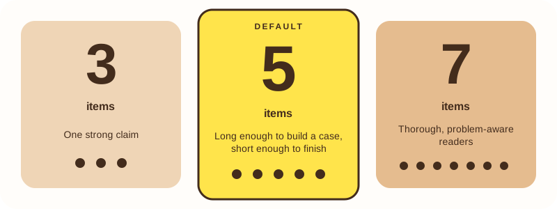
Pagedeck's rule: five is the default because it is "long enough to build a case and short enough to finish". Three fits a single strong claim. Four fits a product with exactly four real differentiators. Seven fits thorough, problem-aware readers.
ConvertFlow's examples follow this: Earthling Co., Rejuvia, Moon Pod, Jones Road Beauty and Caraway use five items, and Fang Oral Care uses seven. Do not pad. One fewer real item beats one filler item.
Anatomy of the page and of one item
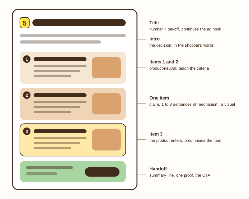
The title gives a number and a payoff, and continues the ad's hook. That is your message match. Avoid a brand tagline or "the complete guide".
The intro is short. Name the decision the shopper faces, in their words, and move on.
Each item has three parts, per Pagedeck: a bold claim, one to three sentences of mechanism, and a visual. A claim with no mechanism is filler. An item that runs near 300 words breaks the scanning that makes the format work.
The handoff closes the page: a summary line, one proof element, and the CTA.
Where the product enters and where proof goes
Keep items 1 and 2 product-neutral. They build trust by teaching the reader what to look for. The product enters at item 2 or 3 (one of Pagedeck's examples waits until item 4), as the thing that happens to meet the criteria.
Put proof inside the item it supports: a review next to the claim it backs, a figure next to the fact it shows. Pagedeck's one exception is a comparison table, which belongs at the handoff. Never invent a quote or a number to fill an item.
How many CTAs
This is where the sources split:
- Pagedeck puts the buy box at the handoff and says it should not sit "two scrolls down". Its sticky CTA option is fine, and one example places a CTA after every item.
- ConvertFlow advises a CTA "at the top and bottom of the page, and throughout if it makes sense". Its examples range from one CTA after the last item plus a closing one (Rejuvia) to above the fold, midway and at the bottom (Fang).
Neither gives data. Brewwwup's sleep mask Guide example uses two: one after the figure, and a closing one. Treat the count as a test variable. Run two CTAs against one, and judge on CVR, revenue per visitor and CPA, not on CTR.
Five mistakes
Padding the list. A filler item to reach a round number makes the whole page feel thin. Five real items beat seven weak ones.
Naming the product in item 1. The page reads as an ad, and the trust you were building is gone.
Claims with no mechanism or visual. A bold line with nothing under it is not an argument. Give each item one to three sentences and a picture.
Items that run long. Near 300 words, the page stops being scannable, and cold traffic bounces.
Using it on the wrong traffic. Retargeting, branded search and products under roughly $25 usually do better on a product page.
Real examples to study
ConvertFlow collected listicle landing pages from Earthling Co. (shampoo bars), Rejuvia (oral sleep sprays), Moon Pod (a stress-relief beanbag), Jones Road Beauty (products for mature skin), Caraway (bakeware) and Fang Oral Care (teeth whitening). It reports no conversion figures for them, so use them to study structure, not as proof of results.
Brewwwup writes this format for you. Paste a product URL, confirm the facts it found, and the Guide is written from only those facts. Try it at app.brewwwup.com.
FAQ
Is a listicle landing page the same as an advertorial?
It is a subtype. An advertorial tells one long story, and a listicle makes several short arguments in a numbered list. Both are pre-sell pages.
How long should it be?
There is no standard length. Pagedeck gives no total, only a warning against items near 300 words. Brewwwup's Guide runs from about 450 to 800 words when it is written from confirmed facts only.
Can I run it on Meta ads?
Yes, it is built for cold paid-social traffic. Label it clearly and follow the platform's rules for the destination page, and check the current policies yourself before you launch.